

You're standing over a finished quilt top with a spool in your hand, wondering whether the thread will support the design or draw attention to every stitch. The answer to what color thread to use for quilting usually isn't an exact hue match. Start by matching the fabric's value, then test the thread on the quilt before committing.
Choosing Thread Color the Smart Way
The most reliable starting point is simple: choose thread that's as light or dark as the fabric, rather than trying to match its exact color. Value describes how light or dark a color appears. A blue, green, or brown can share a similar value with gray, tan, or cream, even though the hues are completely different.
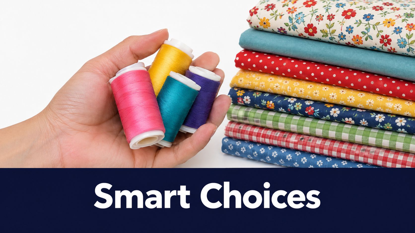
A practical core palette includes black, dark gray, light gray, brown, tan, taupe, ecru, and white. From there, add red, yellow, and blue, along with lighter tints and darker shades. This gives you a manageable working inventory that handles a broad range of quilt tops before you invest in specialty colors for decorative quilting or visible topstitching. APQS explains this value-based thread palette.
Build a useful neutral palette
Neutrals aren't limited to black, white, gray, and brown. A muted blue, green, rose, or gold can also act as a near-neutral when its value sits close to the fabrics beneath it. This is especially useful for quilts made from prints, where a thread that blends with the overall value often looks calmer than one matched to a single flower or stripe.
- Light quilt tops: Start with white, ecru, cream, light gray, or a pale tan.
- Dark quilt tops: Try dark gray, brown, taupe, or a deep color with a similar value.
- Mixed-value quilt tops: A medium neutral, often dove gray, can travel across light, medium, and dark areas without becoming the loudest element.
- Multicolored prints: One carefully chosen neutral usually looks more orderly than switching thread for every fabric.
Before buying a large collection, sketch a few color blocks and note where the quilting lines should recede or stand out. A Bridle Up Hope Shop sketchbook can be useful for recording thread candidates beside fabric swatches.
If your stash includes coordinated precuts, a curated guide to Fat Quarter sets for color matching can help you judge the value range before selecting thread. Whether you visit Our Springfield, Tennessee showroom or compare fabrics online, place thread beside the actual quilt top. A spool in isolation tells you very little.
Matching vs Contrasting Thread Strategies
Matching and contrasting thread aren't competing rules. They create different visual results, and the right choice depends on whether you want the quilting to disappear, support the piecing, or become part of the pattern.
| Strategy | What it does | Works well when |
|---|---|---|
| Matching value | Creates quiet texture and lets the fabric lead | You want the quilting to recede or the quilt has many prints |
| Near-neutral blending | Moves comfortably across related fabrics | The top contains varied hues and several values |
| Deliberate contrast | Makes quilting lines visible and graphic | The stitch design is a major decorative feature |
A matching thread doesn't need to be the same hue as the fabric. A dove gray can blend across a cool multicolor top, while tan or cream may sit comfortably across warm prints. The important question is whether the thread is too light or too dark for the area beneath it.
Scale matters too. Small prints and solids often show a near-matching thread beautifully because the quilting texture adds interest without competing with the fabric. Large-scale florals, bold geometrics, and open negative space can support contrast, especially when the quilting motif needs to be seen from across the room.
Match the thread to the quilting method
Machine quilting produces a continuous, highly readable line. Small tension variations, changes in stitch length, and curves can become more noticeable when thread contrast is high. If you want the stitches to recede, lower contrast usually gives a cleaner result.
Hand quilting has a softer, more forgiving appearance. Higher contrast can work well because the stitches are part of the traditional visual language, rather than a perfectly uniform machine line. WeAllSew discusses how quilting method affects thread visibility.
Design rule: Use contrast because you want the quilting seen, not because the spool happens to look attractive.
An heirloom-style bed quilt often benefits from restrained thread because the fabric and construction need to remain the focus. An art quilt, wall hanging, or modern quilt with broad negative space may call for strong contrast to emphasize lines, grids, spirals, or echo quilting. Neither approach is more correct. The mistake is choosing without deciding what role the stitches should play.
The 24-36 Inch Audition Test
A spool is a poor color reference. Its wound layers make thread appear darker and more saturated than a single strand stitched into fabric. A shade that looks too strong on the spool may blend beautifully in use, while a supposedly quiet color can vanish or create an unexpectedly sharp line.
Use the quilt top as your color chart. Value matters more than an exact hue because one thread must work across the project, not just beside one fabric.
Test the thread across the full value range
Gather 6–8 candidate threads and unwind 24–36 inches of each. Lay the strands directly over the lightest fabric, darkest fabric, and midtone areas. Keep them loose and flat. Judge the thread on the quilt, never while holding the spool above it.
Check the samples in natural light or true-color lighting. Blue or yellow light can make a thread appear warmer, cooler, brighter, or duller than it will in everyday use. Then stand 3–4 feet away and view the quilt as a whole. Sew Nikki recommends this audition distance and thread-length test.
Let the quilt eliminate the wrong choices
Close up, tiny color differences can seem important. From several feet away, the useful distinctions become clearer. You can see which threads disappear, which leave gentle texture, and which draw a distracting line across one fabric.
Use this sequence:
- Lay out all candidates across light, dark, and midtone fabrics.
- Remove obvious mismatches before analyzing every shade.
- Rotate the quilt or change your viewing angle to check the thread across texture.
- Recheck the finalists under another suitable light source.
- Choose the thread that behaves consistently, rather than one that matches a single patch.
A medium neutral such as dove gray often performs well across varied values without pulling strongly warm or cool. It is a useful starting point, not a universal answer.
For machine quilting, make a small test sandwich with the actual batting and backing when possible. Loft and stitch density change how thread settles into the quilt, so a color that works on an app quilt or small project may not behave the same way on a bed quilt viewed across a room. The machine quilting thread guide offers practical reference points for comparing thread behavior with your quilting setup.
Thread Weight and Specialty Options
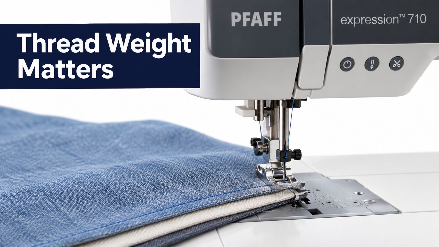
Color gets the attention, but thread weight controls how loudly that color speaks. A fine thread can sink into the fabric and leave texture behind. A heavier thread sits closer to the surface and makes the quilting line more visible, even when the color is fairly close.
For subtle quilting and piecing, 50 wt thread is commonly recommended because its finer profile sinks into the fabric. It supports texture without making the thread line the main feature. Sewing With Ease explains the relationship between 50 wt thread and a receding stitch.
Coordinate the top and bobbin
If the goal is a quiet finish, use the same or a closely matching color in the top and bobbin. Strongly different colors can look interesting in a sample, but they're harder to keep visually clean on both sides of a bed quilt. Matching threads also make small tension variations less noticeable.
That doesn't mean the top and bobbin must always match. A decorative project may intentionally use a contrasting bobbin, and some technical setups call for different weights. Make that decision because you want a two-sided effect, not because you ran out of the top thread.
Your batting choice affects the result as well. A lofty layer can hold the thread near the surface, while a flatter batting may let a fine thread sink more easily. When comparing needle-punched cotton, scrim, and other batting choices, consider how much thread visibility you want after quilting. The thread weight chart can help you compare options before winding the bobbin.
Use specialty thread with a plan
Metallic thread brings shine but needs patient handling. Slow stitching, a quality needle, and careful testing can prevent frustration. Variegated thread changes color along its length, so stitch a scrap before using it on the quilt. The color shifts may create gentle movement, or they may break up a motif in a way you didn't expect.
Thread choice also changes with the material. If you're adapting quilting cotton for a tote or garment, guidance on embroidering on cotton versus polyester offers useful background on how fabric type can affect decorative stitching.
Project-Specific Thread Decisions
Exact color matching is often treated as a requirement, but most successful quilts don't need a separate spool for every fabric. The better question is whether the thread supports the project's scale, construction, and intended use.
An apparel-style project, such as a lined tote bag or a child's summer dress, usually benefits from a lighter visual treatment. Seams, folds, and wear already create movement, so a fine, low-contrast thread can keep the stitching neat without adding unnecessary bulk.
A bed quilt has different demands. Its surface may combine solids, small prints, large florals, and several value groups. A neutral cream, tan, gray, or white can create a more unified appearance than exact color changes across every block.
Choose for the quilt, not just the fabric
When two thread colors seem equally suitable, choose the lighter shade. Lighter thread tends to blend more easily across mixed-value fabrics, while darker thread can create a visible line on light areas. This lighter-thread recommendation is also covered in practical quilting guidance.
Motif choice changes the risk:
- Stippling and meandering: Their irregular paths can soften small variations in thread visibility.
- Straight-line quilting: Long, even rows reveal contrast and spacing, so test carefully.
- Echo quilting: Repeated outlines can become a strong graphic element when the value difference is high.
- Appliqué edges: Choose a thread that supports both the base fabric and the appliqué piece, especially where the outline will remain visible.
- Decorative hand quilting: Contrast can be intentional, particularly when the stitch itself is part of the design.
A quilt for a bed also needs a practical underside. Use the same or closely matching bobbin thread when you want the back to look calm and finished. If the quilt includes a busy backing, the bobbin may be less noticeable, but tension still matters.
For handwork, compare cotton thread, needle size, and fabric weave together. The hand quilting thread guide can help you narrow the choice before you begin stitching.
Our Springfield, Tennessee showroom is a useful place to bring fabric swatches and compare thread directly in person. If you're shopping online, photograph the thread beside your fabric in consistent light, then confirm the final choice with the audition test.
Your Complete Thread Selection Checklist
A scrappy bed quilt may combine Fat Quarters, Layer Cakes, and 2.5-inch strips across light, medium, and dark values. Exact hue matching can create unnecessary decisions. Start with value instead. A medium neutral, tested across the full quilt top, often keeps the stitching visually steady.
A small wall quilt gives you more room to use contrast. Visible grids, bold curves, and other decorative quilting can make thread part of the composition. A color that disappears on a bed quilt may become the main design line on a smaller piece.
Use this checklist before loading the machine or threading the needle:
- Read the values: Identify the lightest, darkest, and middle-value fabrics.
- Set the intent: Decide whether the stitches should blend, add texture, outline shapes, or decorate.
- Test on the quilt: Lay 24–36 inches of each candidate across the top and view it from 3–4 feet, following the audition method described above.
- Select the weight: Use 50 wt when you want finer thread that sinks into the fabric and leaves subtle texture.
- Coordinate the bobbin: Match or closely coordinate top and bobbin colors for a calmer finish on both sides.
- Check the motif: Scrutinize straight lines and echo quilting more closely than forgiving meandering.
- Keep core neutrals ready: Black, gray, brown, tan, taupe, ecru, and white cover many everyday projects.
- Choose lighter when stuck: A lighter option usually blends more easily across mixed-value areas.
Project size and use should guide the final decision. For a bed quilt, prioritize a thread that remains comfortable and quiet across a large surface. For a wall quilt or decorative piece, stronger contrast may be appropriate because the quilting is viewed as part of the design. The same rule applies to smaller sewing projects. Coordinating fabric and thread can help you replace old pillow covers without introducing a mismatched accent.
For a closer comparison of thread weights and uses, consult this best quilting thread guide. Our Springfield, Tennessee showroom also lets you place thread beside fabric before buying.
The Fabric Company carries quilting fabrics, precuts, batting, 108-inch quilt backings, and thread for projects from small gifts to full bed quilts. Browse the quilting collection to build a value-based thread palette, and join The Weekly Thread for practical tips and 10% off your first order.